Greetings Project Managers!
This week on The PM Signal, we delve into a treasure trove of insights from the podcast “How To Create A Dashboard In monday.com”. Whether you’re new to monday.com or looking for a refresher, I’ve distilled the key takeaways to enhance your dashboard creation process. Let’s dive into the essentials!
1. Foundation is Key: Prepare Your Data
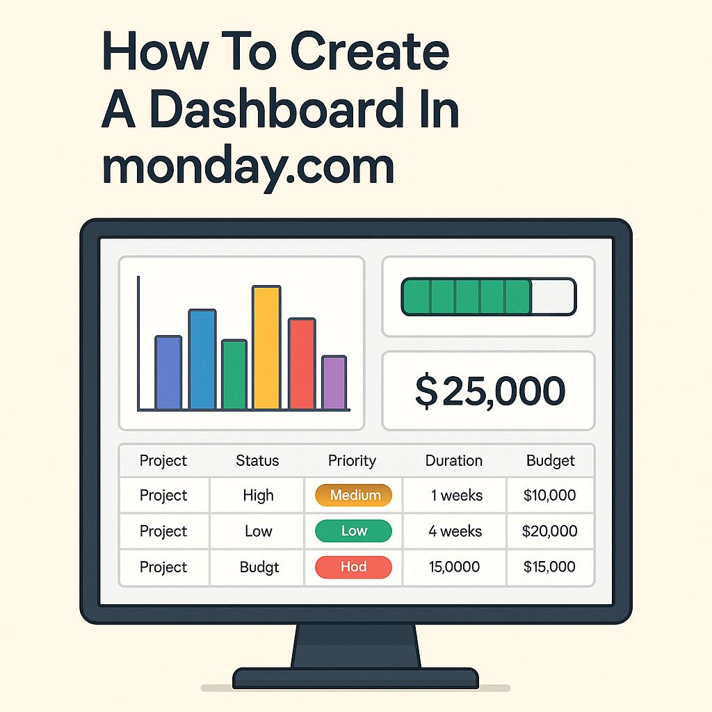
Before you begin building your dashboard, ensure you have all relevant boards and projects in place with consistent columns. Every project should feature the same data structure—think status, priority, duration, and budget—to effectively aggregate insights across your dashboard.
2. Define Your Objectives Clearly
What do you want to visualize? Take time to identify the key performance indicators (KPIs) or metrics that matter most. Document your goals so you have a clear direction during the dashboard creation process. This clarity will guide the types of widgets and data you choose to incorporate.
3. Start Strong: Choose the Right Workspace
When setting up your dashboard, make sure you create it in the appropriate workspace. Select the workspace that matches your reporting goals. Avoid cluttering your environments; instead, create a streamlined space for all your project analyses and insights.
4. Utilize Widgets Wisely
Dashboards come to life with widgets! Leverage various widget types like overview charts, battery indicators for progress, and numbers widgets for budget or duration calculations. Tailor each widget’s settings to pull the precise data that reflects your project landscape.
5. Organize for Clarity and Usability
Keep your dashboard user-friendly. Position high-level summaries (like total portfolio budget) at the top, followed by more specific data. This logical flow ensures stakeholders can quickly grasp essential information without feeling overwhelmed—an essential aspect of effective communication in project management.
Pro Tip: Duplicate and Iterate
Don’t hesitate to duplicate your dashboard if you need to make adjustments. This can be a real time-saver, allowing you to refine existing dashboards without starting from scratch.
Ready to make your dashboards shine? Take these insights and apply them to your project management toolkit. Your next presentation will not only be visually appealing but also informative and strategic!
Looking forward to seeing your impactful dashboards!
Stay sharp,
Nathan

Leave a comment